Letter 36 of 52
Lowercase r in Cursive
Write a clear lowercase r in cursive, with examples you can follow and a free printable practice sheet.
Practice sheets
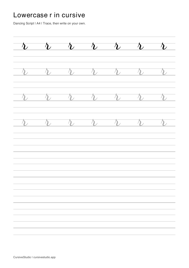
Free printable lowercase r cursive worksheets for tracing, copying, and joining letters. A4 portrait · PDF.
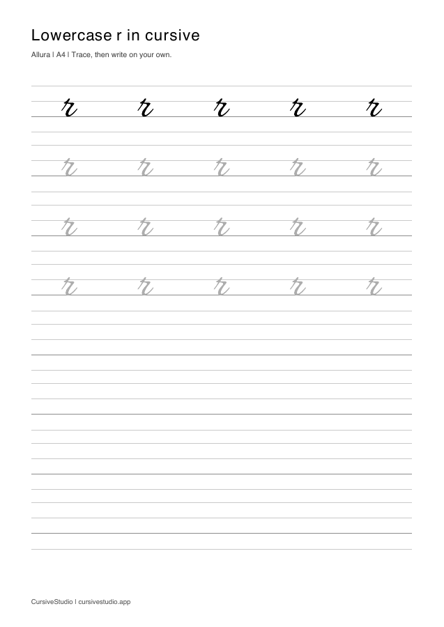
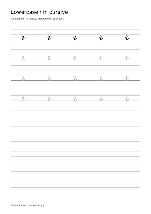
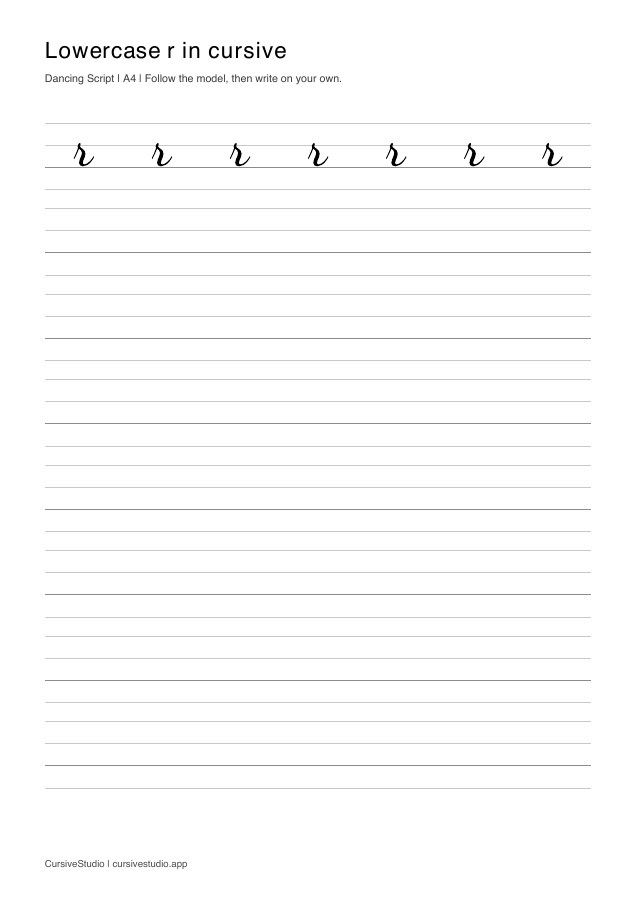
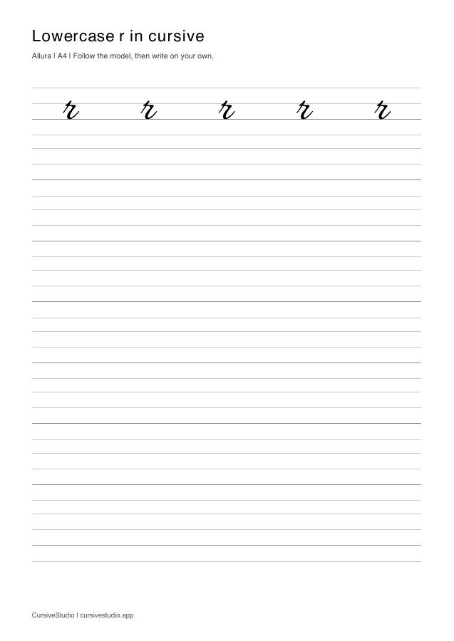
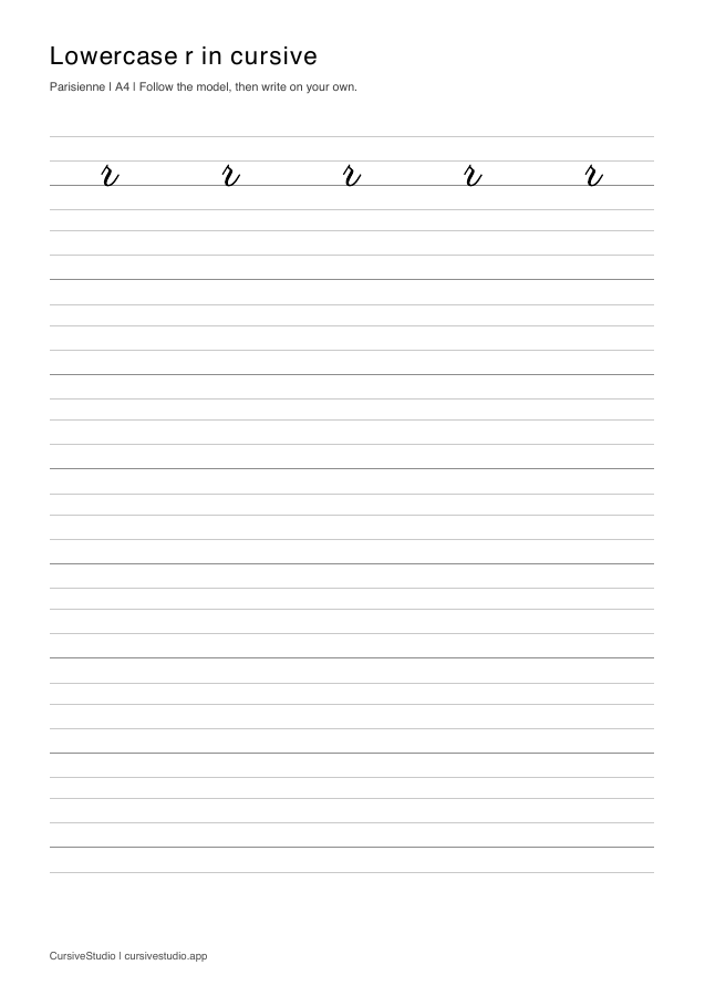
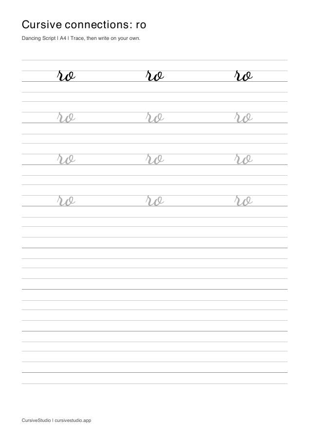
Practise joining r to the next letter
Want another style or setup? Customise below ↓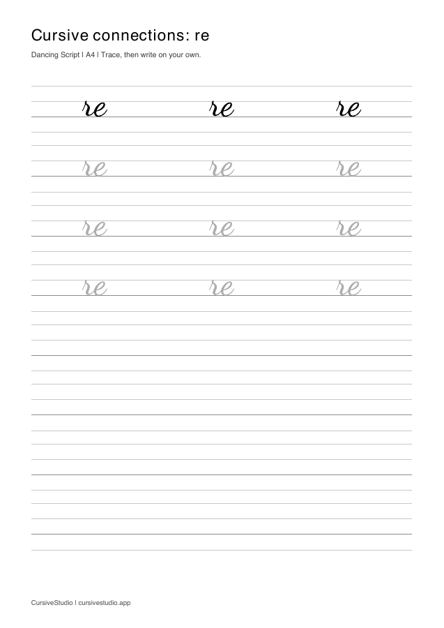
Customise your practice
Practice lowercase r
Need a different style or layout? Choose a writing style, adjust the sheet, and print your own version.
LETTER WORKSHEET · r
SETUP
CURRENT STYLE Dancing Script
WORKSHEET PREVIEW
A4
Practice lowercase r
Connections
Connect lowercase r
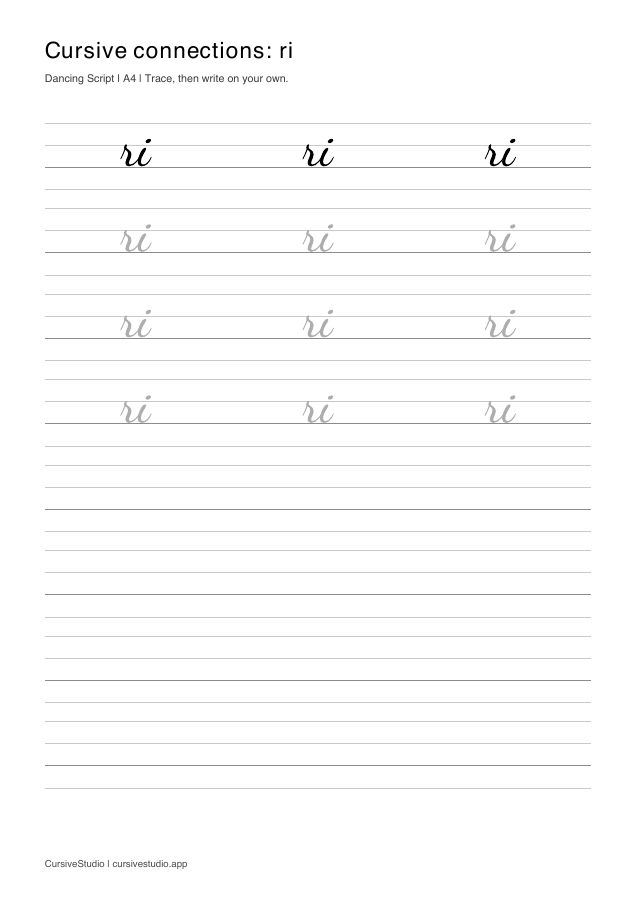
Cursive flows through the spaces between letters. Practice r with common next letters to make the transition feel smoother and more natural.
Letter guide
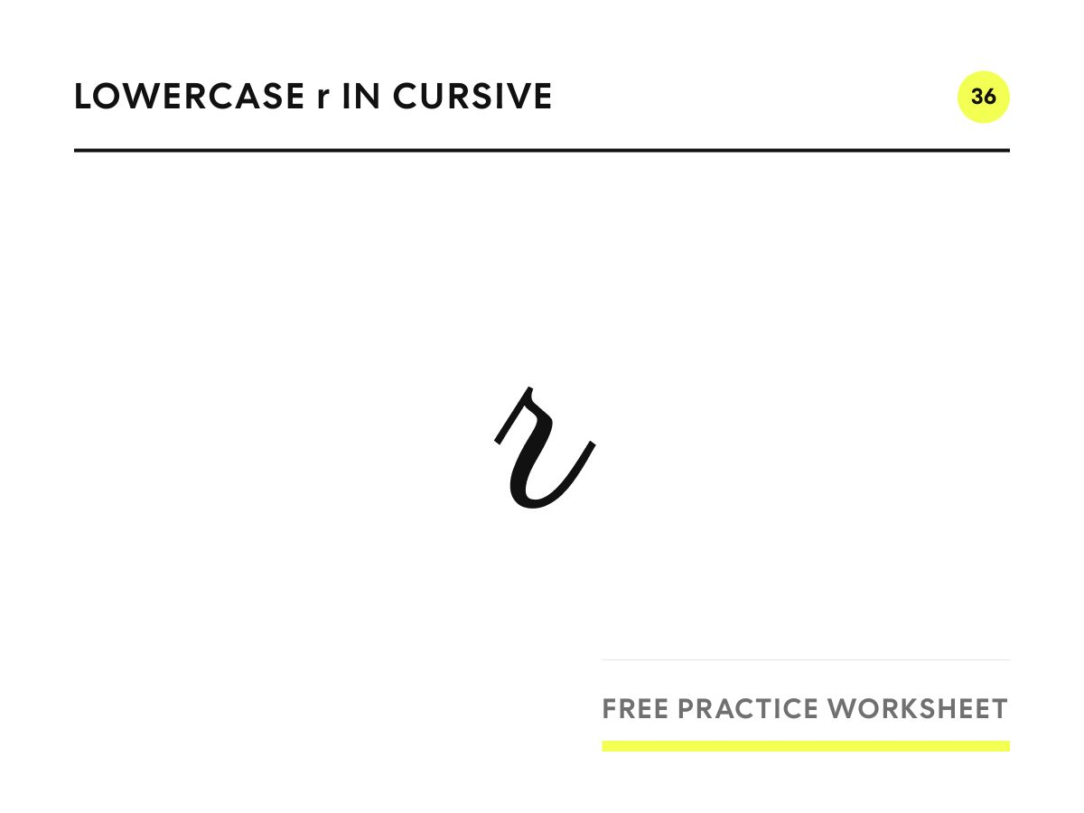
How to write lowercase r in cursive
Stroke by stroke
- Swing up from the baseline to just above the midline.
- Make a small point, or a tiny loop, and step a short way to the right to form the shoulder.
- Pull straight down to the baseline.
- Round off at the bottom and rise into the exit.
Common mistakes
- Missing shoulder. Without the step to the right, r looks like i without a dot. Add the shoulder at the top.
- Round shoulder. A rounded shoulder that dips back down turns r into n or v. Keep it flat or slightly pointed.
- Shoulder too high. A shoulder far above the midline makes r look like a small s. Keep it just above the midline.
Easy to confuse with
Lowercase r is often confused with i, n, s and v. The shoulder separates r from i, its flat top separates it from n, and its straight downstroke separates it from s and v.
Joining to the next letter
Lowercase r exits low. In re, the exit flows into the loop of e. Ri rises to the short stroke of i. Ro needs a bridge into the top of the o, and ra travels right before turning into the oval.
Practice words
- redred
- runrun
- herher
- rarerare
- rainbowrainbow
- veryvery
Questions about lowercase r
Why does my cursive r look like an i?
The shoulder is missing. After the upstroke, step a little to the right at the top before you come down.
Is cursive r taller than other short letters?
Slightly. The shoulder sits just above the midline, so r is a touch taller than a, c or e.
Continue
Choose another cursive letter
Not sure what to practice next? Follow the complete cursive practice guide.